ECHO - the AI powered app
Ultimately, the overarching philosophy of ECHO is to guide users through the grieving process and facilitate a healthy transition into acceptance by allowing them to chat with their loved ones that passed away. The intention is to use the app as a means of expressing unsaid thoughts, finding closure, and achieving catharsis, also while completing activities that will provide them with long lasting tools to get through this difficult times.





AI, grief and design.
AI, grief and design.

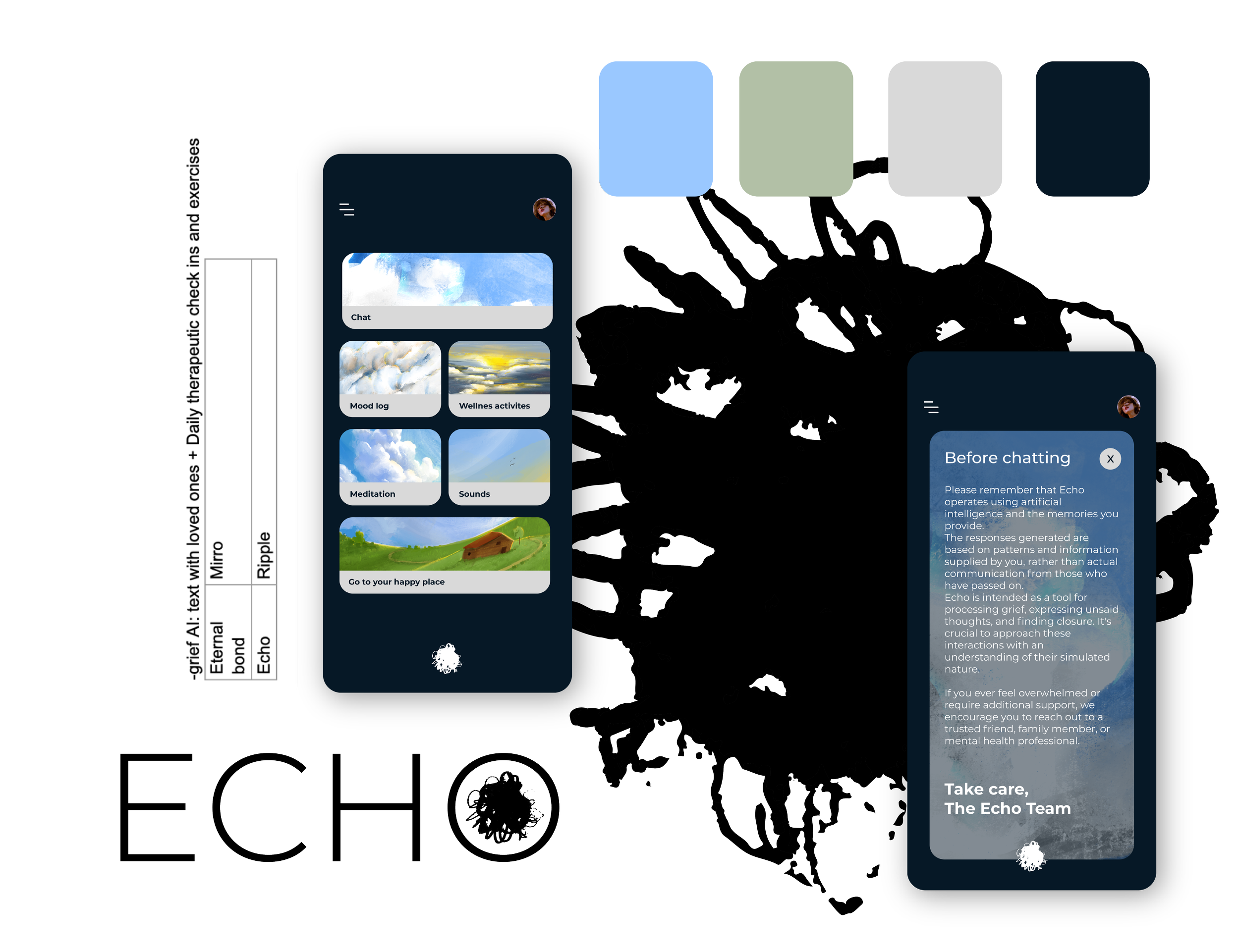
The decision to opt for an illustration-based app was driven not only by a personal love for illustration but also by a desire to evoke a childlike, comforting atmosphere reminiscent of drawing as a means of solace.
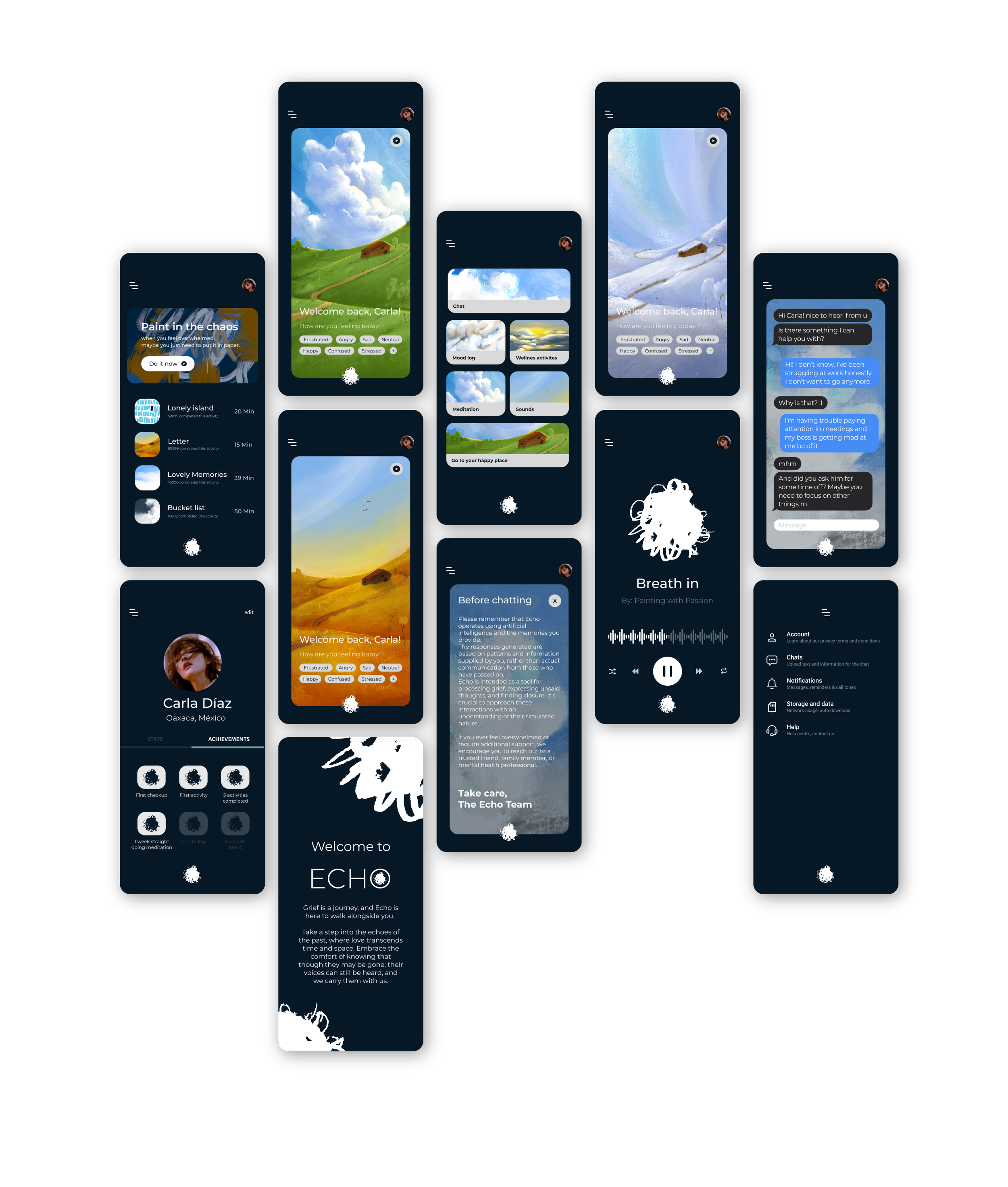
The chosen design incorporates a calming aesthetic with light colors, reflecting peace and comfort. This intentional selection extends to the branding, where simplicity reigns to create a safe space for users. The central visual element is a little house on the hills, representing the user's grief. This visual metaphor serves as the main attraction upon opening the app, presented beautifully to evoke a sense of tranquility.
To discourage app addiction and dependency, the app's main page dynamically changes along with the seasons, allowing users to witness the passage of time. This intentional design choice aligns with the overarching principle of promoting a healthy and mindful usage of the app.
The color palette, featuring light blue and light green hues, contributes to the calming atmosphere, while minimalistic typographies enhance the simplicity and user-friendly nature of the interface.
-
ECHO came to me during a particularly challenging period of grief after losing a loved one. Struggling to cope with the unexpected loss and grappling with the weight of unsaid words, I turned to AI as a way to recreate conversations with the departed. It was a personal experiment, an attempt to find solace in the digital realm. However, my experience with existing AI models fell short – the interactions felt impersonal and awkward. I shared this struggle with my therapist and discovered that many people were turning to written messages as a means of coping with loss.
The turning point occurred when I spoke with a programmer friend about the possibility of training an AI to respond in the manner of a specific person. To my delight, it was indeed possible. This revelation sparked the birth of ECHO. I envisioned an app where individuals could engage in meaningful conversations with AI avatars designed to emulate the personalities of their departed loved ones.
-
Once the possibility of training AI for each specific user was established, a crucial step was to understand and implement the mechanics behind it. Collaborating with programmer professionals, I delved into the technical implications of teaching AI to emulate a particular personality.
The key insight in this process was realizing that AI could comprehend meaning effectively. By providing the right prompts, we could guide the AI to replicate the texting behavior of a specific person. The challenge with traditional AI models lies in their tendency to correct spelling mistakes and sometimes misinterpret user inputs. Recognizing that users might struggle to formulate precise prompts, we adopted a Natural Language Processing (NLP) approach.
In building the interface for ECHO, we established a system where the AI operates in a supervised manner, understanding that when users input data, it's intended for the AI to replicate the texting behavior of their loved ones. This eliminates the need for users to perfectly craft prompts, creating a stable environment where the AI consistently responds in a manner reflective of the designated personality.
How it works “simplified”:
Input Text: It first takes in some text. (like old messages)
Tokenization: The AI breaks down the text into smaller parts called "tokens."
Understanding Meaning: Next, it tries to figure out what all these tokens mean by analyzing their relationships and context.
Making Decisions: Based on its understanding, it makes decisions.
Generating Text: Finally, it puts everything together and generates its own text based on its understanding of the input.
-
The representation of a deceased person through texts, especially in the context of AI applications like ECHO, raises various legal and ethical considerations.
Privacy Laws:
Privacy laws, protect individuals' personal information, even after death. Using personal data to create a digital representation of a deceased person may raise privacy concerns and could be subject to legal restrictions, but ECHO would be programmed to not touch on private information, it is created to just respond to the users’ texts, not by providing extra information nor remembering stuff.
Consent and Right of Publicity:
The "right of publicity," extends to an individual's image, voice, and likeness. Using a deceased person's textual representation might implicate these rights, and obtaining explicit consent or permissions from the deceased person's estate or family may be legally required.
Ethical Considerations:
Beyond legal aspects, ethical considerations play a significant role. Ensuring transparency with users about the nature of the AI representation, setting clear ethical boundaries on the types of conversations allowed, and protecting the emotional well-being of users are essential ethical considerations.
Also, it is important to note that as technology evolves, legal and ethical frameworks may adapt to address emerging challenges in this area.
-
Recognizing the delicate nature of grief and the potential impact on users' emotional well-being, extensive collaboration with psychology experts has been an integral part of the app's development.
A crucial aspect of this collaboration has been the inclusion of a prominent warning within the app interface, emphasizing to users that ECHO is not a substitute for the real person. The goal is to promote a healthy understanding of the app's purpose as a tool for expression and connection rather than a replacement for a genuine relationship.
The grief activities are meticulously curated based on extensive research, drawing from reputable psychology papers and essays. These activities are designed to align with proven strategies that aid in coping with grief and fostering emotional well-being.